Every Angular beginner can agree that components are one of the “first things first” into building your first app. Since Angular 2, components have been the core building blocks of Angular applications. Components are composed of many utilities that serve your application in visuals and the logic behind it. Thus, it’s important to know what these components are, what they serve, how to work with them, and how to use them to make better adjustments within your application.
What is a component?
Components in Angular are the core building blocks that control parts of the view, which include templates, styles and logic. With components, you can easily structure the user interface, as each of them controls a different bit of the whole view.
There are UI and feature components to control visual and functional aspects of the program respectively. When you create components, you can optimize some of them for presentation purposes without any logic, and some of them to hold logic, managing the data that is transferred to UI components. They’re also referred to as dumb and smart components respectively.
Think of a big box in which you want to organize the groceries you bought. You have different kinds of fruits, vegetables, and snacks that you want to group them (e.g, fruits in one place, and each type of fruit grouped together). Instead of filling in that one single box according to the plan you made in your head, it should sound easier to get smaller boxes to group them outside, and then put those boxes inside the big one. For example, you get a small box for all of the apples, another one for pears, bananas, kiwis etc., a bigger one to put all the fruit boxes in to make one big fruit box, then finally put it in the groceries box, along with the vegetable and snack boxes you’ve organized the same way.
This example depicts how you can organize the components in your Angular application, where each box represents a component, and the way you put the items in the box is the template. In terms of component roles, each smaller box is a UI component, and the big groceries box serves as the feature component, as when you want to move some items within, you take them out of their own box (i.e, emit output event) and notify another box, which listens and reacts.
In a typical application where you put your declared components, without declaration, it would look like nested templates, which, either way, they technically are. However, components do much more than substituting for HTML code. While they dramatically reduce the number of lines in the code, they manage the whole functionality of distinct parts of the application.
Structure of a component
Each component created by Angular CLI contains files for the template, styling, logic and optionally unit tests. Templates are HTML files that define the view layout containing DOM elements and the UI components. Styles are defined in a CSS file, or SCSS, Sass, Less, depending on your choice when creating a new project. Component logic is defined by the TypeScript code which includes properties, methods, lifecycle hooks that control the component behaviour and interactions. Optionally, there are also tests, which are TypeScript files containing unit tests for the component logic.
Until Angular 20, component files were named after the component’s name followed by a component extension and the file extension of the part of the component. For example, for the main component called App, which is by default added in the project files, the component files are called as follows:
app.component.html – template
app.component.css – styles
app.component.ts – logic
app.component.spec.ts – tests (optional)
With Angular 20, if you use Angular CLI for generating the files, it can sometimes omit the .component extension as well as other extensions. In this case, Angular component files may be named like this:
app.html – template
app.css – styles
app.ts – logic
app.spec.ts – tests (optional)
While it’s still possible to use the old pattern, it’s good to know to not be confused.
Creating a component
You can create a component in 2 ways: through Angular CLI or by creating them manually. Angular CLI handles many things, including the creation of the components. The command to create a component is as follows:
ng generate component ComponentNameor in short,
ng g c ComponentNameThis command will create a folder inside app/ folder, and in it create the following:
- component-name.component.css
- component-name.component.html
- component-name.component.spec.ts
- component-name.component.ts
Angular CLI implements a practice called Separation of Concerns (SoC), so it creates the template and style sheet, along with the component file. This practice encourages tidy code and improves readability, as it prevents the files from being very long. For small components, you might sometimes see an entire component defined in a single file, the .ts file. It is totally possible, and I will get to it later in the article.
Now I’ll talk about how you can manipulate the commands to Angular CLI for different settings.
If you want to omit the unit test files, add –skip-tests flag at the end of the command:
ng generate component ComponentName --skip-testsThis command will create your component in the same way as above but without the .spec.ts file.
If you want to create the component files in the current folder, add –flat flag:
ng generate component ComponentName --flatThis command will create your component in the same folder which you are in, and won’t create a folder for the component files.
If you want to see a preview of what would the command create, add –dry-run, or -d for short:
ng generate component ComponentName --dry-runThis command will show you the files it will create without actually creating them.
If you want to generate the component with inline styles and/or templates:
ng generate component ComponentName --inline-styles --inline-templateThis command will create the component with inline styles and the template in the .ts file, omitting .html and .css files. You can also use -s and -t respectively, in short form.
Other flags include metadata, modules and control-related flags:
| Flag | Alias | Description | Example |
| –change-detection | -c | Sets the change detection strategy to what you pass to the parameter, either OnPush or Default. | ng g c ComponentName –change-detection=OnPush |
| –standalone | Sets the standalone property to either true or false. | ng g c ComponentName –standalone=true | |
| –selector | Overrides the default selector name (usually in the form of “app-component”) | ng g c ComponentName –selector=app-comp | |
| –view-encapsulation | Sets the encapsulation strategy. Can be “Emulated” (default), None, or ShadowDom | ng g c ComponentName –view-encapsulation=None | |
| –prefix | -p | Sets the prefix for the component selector, overriding the default prefix in angular.json configuration. (usually “app”) | ng g c ComponentName –prefix=proj |
| –module | -m | Specifies in which module to declare the new component | ng g c ComponentName –module=app.module |
| –export | Adds the component to the exports array of the specified module and makes it available to other components | ng g c ComponentName –module=app.module –export | |
| –skip-import | Omits adding the component to any module’s imports or declarations array. | ng g c ComponentName –skip-import | |
| –skip-selector | Generates the component without a selector. Not all components need a selector, depending on the complexity of your app 🙂 | ng g c ComponentName –skip-selector | |
| –style | Specifies the file extension for stylesheets. Normally, the CLI would ask you in the process. | ng g c ComponentName –style=scss | |
| –type | Adds a suffix to the generated file names. The default suffix is “component”. “ui” is passed in the example, so the file would be named “component-name.ui.ts” | ng g c ComponentName –type=ui |
Basic Component
A basic component in Angular is when you have a stateless component, without extensions, services, nor advanced features.
An example of a basic component:
// profile-photo.ts
import { Component } from '@angular/core';

@Component({
  selector: 'app-profile-photo',
  template: `<img src="profile-photo.jpg" alt="Your profile photo">`,
  styles: `img { border-radius: 50%; }`,
  changeDetection: ChangeDetectionStrategy.OnPush
})
export class ProfilePhoto { }
or, alternatively
// profile-photo.ts
import { Component } from '@angular/core';

@Component({
  selector: 'app-profile-photo',
  templateUrl: './profile-photo.html',
  styleUrl: './profile-photo.css',
  changeDetection: ChangeDetectionStrategy.OnPush
})
export class ProfilePhoto { }
// profile-photo.html
<img src="profile-photo.jpg" alt="Your profile photo">
// profile-photo.css
img { border-radius: 50%; }Example source: https://angular.dev/guide/components
Note: All of the examples shown in this article are from the latest version of Angular
Taking these examples, we’ll move on from the basics to the syntax of a component file.
Metadata
Every component file is generated with @Component decorator imported from angular/core. Inside this decorator, there is an object which is referred to as the component’s metadata. The metadata primarily includes the selector, templateUrl, and styleUrl properties by default when you generate a component via Angular CLI. If you choose not to use external stylesheet nor the markup files, then you can define an inline template and styles followed by template: and styles: respectively. In this case template and style files aren’t needed, but the TypeScript file is a must.
There are more advanced properties to the component metadata which are not immediately required, but I will explain the most commonly used ones.
Selector
A selector’s purpose in a component is to define a specific tag to be used in templates and styles etc. The selector has to be unique to a component, so that Angular doesn’t confuse them. The selector can be used as a CSS selector or an element inside another component, for example:
// profile-photo.ts
@Component({
  selector: 'app-profile-photo',
  template: `<img src="profile-photo.jpg" alt="Your profile photo">`,
  styles: `img { border-radius: 50%; }`,
  changeDetection: ChangeDetectionStrategy.OnPush
})
export class ProfilePhoto { }
// user-profile.ts
@Component({
template: `
<profile-photo />
<button>Upload a new profile photo</button>`,
...,
imports: [ProfilePhoto],
changeDetection: ChangeDetectionStrategy.OnPush
})
export class UserProfile { }In a setup like this, Angular renders the contents of ProfilePhoto inside the UserProfile component template.
The types of selectors are as follows: element, attribute and class. The selector that’s primarily used in components is referred to as the element selector. The example usage of an element selector is demonstrated above.
Let’s get to attribute selectors. They come in handy when your component contains a child of its parent DOM element, as some DOM elements cannot have any additional nodes between them. Hence, attribute selectors turn a necessary element into a component without breaking the hierarchy.
For example, take into account a table of contents:
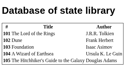
with the following markup:
<h1>Database of state library</h1>
    <table class="table table-striped">
  <thead>
    <tr>
      <th scope="col">#</th>
      <th scope="col">Title</th>
      <th scope="col">Author</th>
    </tr>
  </thead>

  <tbody>
    @for(book of books(); track book.id){
      <tr>
        <th scope="row">{{ book.id }}</th>
        <td>{{ book.title }}</td>
        <td>{{ book.author }}</td>
      </tr>
    }
  </tbody>
</table>
Let’s make a component out of the rows that display the content:
// table-row-content.component.ts
@Component({
  selector: 'app-table-row-content',
  imports: [],
  templateUrl: './table-row-content.html',
  styleUrl: './table-row-content.css',
  changeDetection: ChangeDetectionStrategy.OnPush
})
export class TableRowContent {
  readonly book = input.required<Book>();
}
// table-row-content.component.html
<tr>
  <th scope="row">{{ book().id }}</th>
  <td>{{ book().title }}</td>
  <td>{{ book().author }}</td>
</tr>
// app.component.html
<h1>Database of state library</h1>
      <table class="table table-striped">
    <thead>
      <tr>
        <th scope="col">#</th>
        <th scope="col">Title</th>
        <th scope="col">Author</th>
      </tr>
    </thead>

    <tbody>
      @for(book of books(); track book.id){
          <app-table-row-content [book]="book"/>
      }
    </tbody>
  </table>
Let’s check out the table:
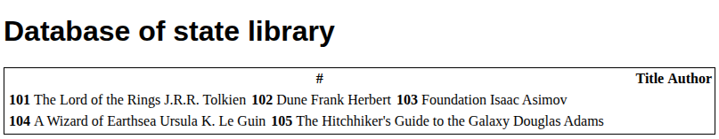
What’s wrong? The HTML table is one of the DOM elements which has child elements that have to exist. So, substituting <tr> with a component won’t work. Instead, you can set up an attribute selector:
// table-row-content.component.ts
@Component({
  selector: '[app-table-row-content]',
  imports: [],
  templateUrl: './table-row-content.html',
  styleUrl: './table-row-content.css',
  changeDetection: ChangeDetectionStrategy.OnPush
})
export class TableRowContent {
  readonly book = input.required<Book>();
}
Now, move <tr> from the child component back inside the <tbody> in parent, and place the selector like this:
// app.component.html
<h1>Database of state library</h1>
      <table class="table table-striped">
    <thead>
      <tr>
        <th scope="col">#</th>
        <th scope="col">Title</th>
        <th scope="col">Author</th>
      </tr>
    </thead>

    <tbody>
      @for(book of books(); track book.id){
        <tr app-table-row-content [book]="book"></tr>
      }
    </tbody>
  </table>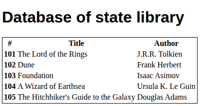
Play with this code right here.
Class selectors are similar, but their main purpose is to add behaviour to styled elements. Just like attribute selectors, they’re ideal for reusable components that make up a single DOM element, like button, table etc. Let’s see the solution above, but with class selectors:
// table-row-content.component.ts
@Component({
  selector: '.app-table-row-content',
  imports: [],
  templateUrl: './table-row-content.html',
  styleUrl: './table-row-content.css',
  changeDetection: ChangeDetectionStrategy.OnPush
})
export class TableRowContent {
  readonly book = input.required<Book>();
}
// app.component.html
<h1>Database of state library</h1>
      <table class="table table-striped">
    <thead>
      <tr>
        <th scope="col">#</th>
        <th scope="col">Title</th>
        <th scope="col">Author</th>
      </tr>
    </thead>

    <tbody>
      @for(book of books(); track book.id){
        <tr class="app-table-row-content" [book]="book"></tr>
      }
    </tbody>
  </table>
Here, we declare the component selector as CSS class selector and pass it to the element’s class attribute. The demo program above contains both approaches, with one of them commented out.
Imports
In every component, an imports array is available. in which you can import other components, directives, pipes etc. and use them inside your component. Here’s an example:
import { Component } from '@angular/core';
import { CounterComponent } from './counter/counter.component';
import { MessagesComponent } from './messages/messages.component';

@Component({
  selector: 'app-root',
  standalone: true,
  templateUrl: './app.component.html',
  styleUrl: './app.component.css',
  imports: [CounterComponent, MessagesComponent],
})
export class AppComponent {/* ... */}
Standalone
Determining whether a component is standalone or not is done by setting the standalone: property, which takes true or false. Since Angular 14, the components can be defined as standalone and since Angular 19, the components are standalone by default. Given this, components can be directly imported via the imports array in other standalone components. In the older versions it was necessary to add standalone: true inside the decorator. Also, the components may have the standalone property set to false right away, which means you’d have to import NgModule.
Providers
Angular components have a providers array to provide dependencies at the component level. Passing a class as a provider token tells the injector to instantiate a new class of the given type.
import { Injectable } from '@angular/core';

@Injectable()
export class LoggerService {
  id = Math.random();

  log(message: string) {
    console.log(`[${this.id}] ${message}`);
  }
}
import { Component } from '@angular/core';
import { LoggerService } from './logger.service';

@Component({
  selector: 'child-a',
  template: `<p>Child A works!</p>`,
  providers: [LoggerService]
})
export class ChildAComponent {
  // private _logger = inject(LoggerService);
  constructor(private _logger: LoggerService) {
    this._logger.log('Child A created');
  }
}
Here, ChildAComponent adds LoggerService to its providers to create a new instance of the LoggerService class in the component’s injector tree. This way, it will be available for the component to inject it within itself.
NOTE: In newer applications, inject() is preferred to create an instance of dependencies. It’s an alternative to DI, but see more here to know why it’s more popular.
Mind you, that sometimes you might see services created by Angular CLI that include providedIn: ‘root’ inside the @Injectable decorator. It automatically creates the instance of the class at the root injector tree and, as a result, providing that service at the component level won’t be necessary.
Services aren’t the only thing you can provide. The types of providers include class providers, value providers, factory providers, aliases, and injection tokens.
Classes can also be provided using useClass:
providers: [{ provide: LoggerService, useClass: LoggerService}]This is the long form of the example code that provides LoggerService to the component.
Value providers and Injection tokens can be used to inject non-class dependencies. The most common use cases of injection tokens are defining injectable tokens for API URLs or endpoints, configuration objects and environment specific values.
import { InjectionToken, Inject, Component } from '@angular/core';

export const API_URL = new InjectionToken<string>('API URL');

@Component({
  selector: 'app-root',
  template: `<p>Check the console</p>`,
  providers: [
    { provide: API_URL, useValue: 'https://api.example.com' } // token is API_URL
  ]
})
export class AppComponent {
  constructor(@Inject(API_URL) private apiUrl: string) {
    console.log('API URL:', this.apiUrl);
  }
}
In this example, API_URL is a unique token and useValue associates it with a literal value. When it’s injected API_URL possesses this literal value.
Factoryproviders use the useFactory provider key to tell Angular to run a function that creates the dependency object.
providers: [
  {
    provide: LoggerService,
    useFactory: () => new LoggerService()
  }
]
Alias providers use the useExisting provider to map one token to another. As a result, a way of accessing the token will be created. For example:
providers: [
    BetterLoggerService,
    { provide: LoggerService, useExisting: BetterLoggerService }
]
The injector injects BetterLoggerService as a singleton and maps it to LoggerService, which serves as an alias to BetterLoggerService. In other words, whenever the LoggerService is asked, it creates an instance of BetterLoggerService instead.
viewProviders
It’s conceptually similar to providers, but the main difference is that configured providers in viewProviders are only accessible to view children and not the content children projected with ng-content, while providers give access to all children. This makes it ideal for creating a private service instance with limited access (content children can’t use it), or if you want to prevent injection conflicts with a content child, in case it injects the same service.
Encapsulation
When you write stylesheets for your components, Angular doesn’t dump them in a global stylesheet. Instead, it relies on a style scoping mechanism to prevent them from interrupting unrelated parts of the app. This mechanism is set via the encapsulation property. There are 3 view encapsulation settings: Emulated (default), ShadowDom, and None.
- ViewEncapsulation.Emulated:
In this mode, Angular rewrites the CSS selectors to be component-scoped and adds unique attributes to the DOM classes. This way, Angular ensures the CSS styles apply only to the dedicated component. However, global styles defined outside of a component may still affect elements inside a component with emulated encapsulation.
For example, imagine you defined a component with styles like this:
@Component({
  selector: 'app-hello',
  template: `<p>Hello</p>`,
  styles: [`p { color: red; }`],
  encapsulation: ViewEncapsulation.Emulated
})
After rendering and checking the dev tools, you may see your CSS and DOM are generated like this:
<p _ngcontent-abc="">Hello</p>p[_ngcontent-abc] { color: red; }- ViewEncapsulation.ShadowDom:
In this mode, Angular enables a shadow tree containing only the dedicated component’s elements. This is not built in Angular, so you’d use an installed API to handle it. The bright side of this method is that even global styles can’t disturb the elements of the dedicated component. After rendering, your component and the generated DOM may look like this:
import { Component, ViewEncapsulation } from '@angular/core';

@Component({
  selector: 'app-profile-card',
  template: `
    <div class="card">
      <h2>John Doe</h2>
      <p>Frontend Developer</p>
    </div>
  `,
  styles: [`
    .card {
      border: 2px solid blue;
      padding: 1rem;
      background: lightyellow;
      font-family: Arial, sans-serif;
    }
    h2 {
      color: darkblue;
    }
  `],
  encapsulation: ViewEncapsulation.ShadowDom
})
export class ProfileCardComponent {}
<app-profile-card>
  #shadow-root
    <style>
      .card {
        border: 2px solid blue;
        padding: 1rem;
        background: lightyellow;
        font-family: Arial, sans-serif;
      }
      h2 {
        color: darkblue;
      }
    </style>
    <div class="card">
      <h2>John Doe</h2>
      <p>Frontend Developer</p>
    </div>
</app-profile-card>
- ViewEncapsulation.None:
In this mode, there’s no encapsulation, and all registered styles are treated as global styles.
@Component({
  encapsulation: ViewEncapsulation.None
})
Component lifecycle hooks
Components in Angular have a lifecycle too! Their lifecycle starts from the creation phase, to change detection, rendering, and destruction. There are specific hooks in which you can run some code during different phases of the lifecycle. For beginners, there are 2 most important hooks to cover in this chapter: ngOnInit and ngOnDestroy (apart from constructor()). We will cover these 2 lifecycle hooks, as you’ll be eligible to run them for the most basic Angular projects.
- ngOnInit():
This method runs exactly once during the component lifecycle, and it does so after initialization of all the component’s inputs, so after constructor(). Let’s take a look at a basic example of a greeting application:
// greeting.component.ts
import { Component, input, OnInit } from '@angular/core';

@Component({
  selector: 'app-greeting',
  template: `
    <h2>{{ greetingMessage }}</h2>
  `
})
export class GreetingComponent implements OnInit {
  readonly name = input.required<string>();
  greetingMessage = '';

  constructor() {}

  ngOnInit(): void {
    this.greetingMessage = `Hello and welcome, ${this.name()}! 👋`;
  }
}
// app.component.ts
import { Component } from '@angular/core';
import { GreetingComponent } from './greeting.component';

@Component({
  selector: 'app-root',
  template: `
    <h1>My App</h1>
    <app-greeting [name]="'Alice'"></app-greeting>
  `,
  imports: [GreetingComponent],
})
export class AppComponent {}
The constructor is empty in GreetingComponent because firstly, there’s nothing we have to define there, and secondly, the input name is not yet available at the construction stage. Check this demo here.
- ngOnDestroy():
This method runs exactly once before the component is destroyed, i.e, cleaned up after being removed from the view. Its primary function is to perform cleanup tasks and, particularly, releasing sources that won’t be cleaned up automatically.
Let’s add ngOnDestroy() to the greeting app:
// greeting.component.ts
import { Component, input, OnInit, OnDestroy } from '@angular/core';

@Component({
  selector: 'app-greeting',
  template: `
    <h2>{{ greetingMessage }}</h2>
  `
})
export class GreetingComponent implements OnInit, OnDestroy {
  name = input.required<string>();
  greetingMessage = '';

  ngOnInit(): void {
    console.log(`Fetched ${this.name()}`);
    this.greetingMessage = `Hello and welcome, ${this.name()}! 👋`;
  }

  ngOnDestroy(): void {
    console.log(`Greeting for ${this.name()} destroyed. Goodbye! 🛑`);
  }
}
// app.component.ts
import { Component } from '@angular/core';
import { GreetingComponent } from './greeting.component';

@Component({
  selector: 'app-root',
  standalone: true,
  template: `
    <h1>My App</h1>
    <button (click)="showGreeting = !showGreeting">
      Toggle Greeting
    </button>

    @if (showGreeting) {
      <app-greeting [name]="'Alice'"></app-greeting>
    }
  `,
  imports: [GreetingComponent]
})
export class AppComponent {
  showGreeting = true;
}
A toggle button is added to the previous example to demonstrate ngOnDestroy, which will run after the toggle button removes the component from the app view.
Check this example here. The lifecycle hooks are best inspected in the dev tools console (press F12).
Check this page to discover more lifecycle hooks and for more information.
Summary
Components are the core building blocks of Angular projects. Most of the time you’ll use Angular CLI to generate components, but it’s important to know the syntax of component files, and what each part does. Components are defined by a decorator containing the metadata, with primarily set properties, which can be customized or omitted when not needed. With standalone components introduced in Angular 14, it’s possible for each of them to import other standalone components, regardless of where they are in your project folder (it’s still best to be organized though). You have also learned about the component lifecycle, and that you can run some logic in each of its phases. Happy coding!